Complying with ADA sign regulations doesn't have to be complicated. HealthcareSigns.com offers expert solutions to ensure your facility's signage is accessible and meets the latest ADA guidelines.
The Americans with Disabilities Act (ADA) is a civil rights law that came into effect in 1990. The ADA ensures that people with disabilities have the same rights, opportunities, and equal accommodations and accessibilities that are available to the general public. This applies to all public areas (work, schools, transportation, etc.) and all public and private places that are open to the general public. The law strictly prohibits any form of discrimination against anyone with a disability, guaranteeing equal opportunity for those with disabilities in public accommodations, employment, transportation, state and local government services, and telecommunications.
Title III regulations specifically addresses public accommodations and commercial facilities. Title III prohibits discrimination in various areas such as restaurants, schools, medical practices, and more, as well as newly designed or renovated commercial facilities such as office buildings, veterinary clinics, healthcare facilities, and more. Each of these establishments is required to comply with ADA sign regulations and be readily accessible and usable by individuals with disabilities. Not only do these standards aim to provide equal access and opportunities to visitors, patients, and clients, but also provide equal access to the facility's employees.
ADA Signage Requirements
Understanding the ADA as it relates to healthcare signage can be overwhelming. So we compiled a list of frequently asked ADA questions and the key elements required to meet the 2010 ADA Standards for Accessible Design, effective March 15, 2011. While these common ADA questions and answers may be helpful, rest assured in knowing that every ADA sign from HealthcareSigns.com is guaranteed to be ADA‑compliant. And if for some reason, your inspector finds that one of our signs does not meet ADA guidelines, we'll replace it for free! It's just one of the great benefits of ordering from HealthcareSigns.com.
Common ADA Questions
When was the ADA established and signed into law?
The Americans with Disabilities Act, or ADA as most call it, was signed into law on July 26, 1990. The law was established to guarantee that people with disabilities would have the same opportunities as everyone else in the U.S. Then in September of 2010, the Attorney General published the latest regulations, which included an updated version of the ADA Standards for Accessible Design. These revised rules went into effect on March 15, 2011, and are what we adhere to today.
What is a dual sign, and does my healthcare facility need one?
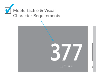
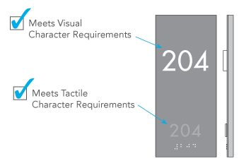
A dual sign is simply a sign that meets both visual requirements and tactile requirements. While most people tend to use one sign for both visual and tactile requirements, some choose to use separate signs for design purposes. Either method can be used to achieve ADA compliance.
703.1 General. Where both visual and tactile characters are required, either one sign with both visual and tactile characters, or two separate signs, one with visual, and one with tactile characters, shall be provided.
Where can I find ADA‑compliant fonts for my signs?
One thing to keep in mind when selecting a font is that raised text signs and visual text signs have different requirements when it comes to stroke width and serifs. If you intend to meet both tactile and visual specifications, you'll want to select a font that meets both sets of requirements.
Raised Character Signs -
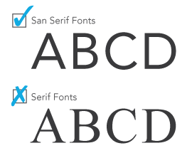
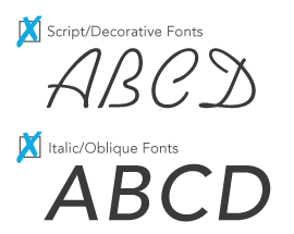
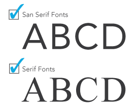
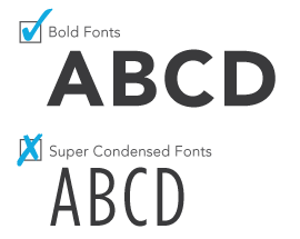
703.2.3 Style. Characters shall be sans serif. Characters shall not be italic, oblique, script, highly decorative, or of other unusual forms.
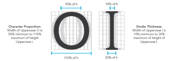
703.2.4 Character Proportion. Characters shall be selected from fonts where the width of the uppercase letter "O" is 55 percent minimum and 110 percent maximum of the height of the uppercase letter "I".
703.2.6 Stroke Thickness. Stroke Thickness of the uppercase letter "I" shall be 15 percent maximum of the height of the character.
Visual Character Signs -
703.5.3 Style. Characters shall be conventional in form. Characters shall not be italic, oblique, script, highly decorative, or of other unusual forms.
703.5.4 Character Proportion. Characters shall be selected from fonts where the width of the uppercase letter "O" is 55 percent minimum and 110 percent maximum of the height of the uppercase letter "I".
703.5.7 Stroke Thickness. Stroke Thickness of the uppercase letter "I" shall be 10 percent minimum and 30 percent maximum of the height of the character.
Are there other ADA font requirements I should be aware of?
Finding a compliant font doesn't stop there. The ADA has several additional requirements on how the individual letters must be placed when manufacturing signs, such as ADA font size. Raised text signs and visual text signs have different requirements that must be met for the signs to be ADA compliant.
Raised Character Signs -
703.2.1 Depth. Raised characters shall be 1/32 inch (0.03125") minimum above their background.
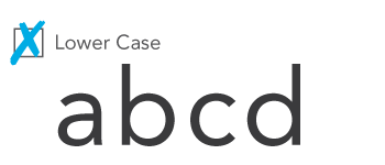
703.2.2 Case. Characters shall be uppercase.
703.2.5 Character Height. Character height measured vertically from the baseline of the character shall be 5/8 inch (0.625") minimum and 2 inches maximum based on the height of the uppercase letter "I".
EXCEPTION: Where separate raised and visual characters with the same information are provided, raised character height shall be permitted to be 1/2 inch (0.5") minimum. (See Dual Signs).
703.2.7 Character Spacing Character spacing shall be measured between the two closest points of adjacent raised characters within a message, excluding word spaces. Where characters have rectangular cross sections, spacing between individual raised characters shall be 1/8 inch (0.125") minimum and 4 times the raised character stroke width maximum. Where characters have other cross sections, spacing between individual raised characters shall be 1/16 inch (0.0625") minimum and 4 times the raised character stroke width maximum at the base of the cross sections, and 1/8 inch (0.125") minimum and 4 times the raised character stroke with maximum at the top of the cross sections.
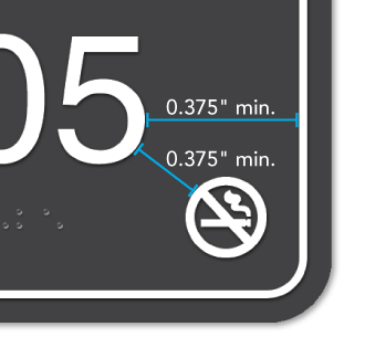
Characters shall be separated from raised borders and decorative elements 3/8 inch (0.375") minimum.
703.2.8 Line Spacing. Spacing between the baselines of separate lines of raised characters within a message shall be 135 percent minimum and 170 percent maximum of the raised character height.
Visual Character Signs -
703.5.2 Case. Characters shall be uppercase or lowercase or a combination of both.
703.5.5 Character Height. Minimum character height shall comply with Table 703.5.5. Viewing distance shall be measured as the horizontal distance between the character and an obstruction preventing further approach towards the sign. Character height shall be based on the uppercase letter "I".
703.5.5 Visual Character Height
Height from Finished Floor or Ground from Baseline of Character
Horizontal Viewing Distance
Minimum Character Height
40 inches (1015mm) to less than or equal to 70 inches (1780mm)
Less than 72 inches (1830mm)
5/8 inch (16mm)
72 inches (1830mm) and greater
5/8 inch (16mm), plus 1/8 inch (3.2mm) per foot (305mm) of viewing distance above 72 inches (1830mm)
Greater than 70 inches (1780mm) to less than or equal to 120 inches (3050mm)
Less than 180 inches (4570mm)
2 inches (51mm)
180 inches (4570mm)
2 inches (51mm), plus 1/8 inch (3.2mm) per foot (305mm) of viewing distance above 180 inches (4570mm)
Greater than 120 inches (3050mm)
Less than 21 feet (6400mm)
3 inches (75mm)
21 feet (6400mm) and greater
3 inches (75mm), plus 1/8 inch (3.2mm) per foot (305mm) of viewing distance above 21 feet (6400mm)
703.2.8 Spacing. Character spacing shall be measured between the two closest points of adjacent characters, excluding word spaces. Spacing between individual characters shall be 10 percent minimum and 35 percent maximum of character height.
703.2.9 Line Spacing. Spacing between the baselines of separate lines of characters within a message shall be 135 percent minimum and 170 percent maximum of the character height.
Which interior signs are required to have braille?
Braille is required on signs that are designating a permanent space, such as an office door identification sign or an all gender restroom sign. You also find them as door signs leading to exit doors and stairways. You should always use a domed and rounded style, contracted Grade 2 Braille. What is the difference between Grade 1 and Grade 2 Braille, you may ask? Grade 2 Braille is a shortened form of writing braille words, similar to contractions, which helps shorten words and save valuable space.
703.3 Braille. Braille shall be contracted (Grade 2) and shall comply with 703.3 and 703.4.
703.3.1 Dimensions and Capitalization. Braille dots shall have a domed or rounded shape and shall comply with Table 703.3.1. The indication of an uppercase letter or letters shall only be used before the first word of sentences, proper nouns and names, individual letters of the alphabet, initials, and acronyms.
703.3.2 Position. Braille shall be positioned below the corresponding text. If text is multi-lined, braille shall be placed below the entire text. Braille shall be separated 3/8 inch (0.375") minimum from any other tactile characters and 3/8 inch (0.375") minimum from raised borders and decorative elements.
EXCEPTION: Braille provided on elevator car controls shall be separated 3/16 inch (0.1875") minimum and shall be located either directly below or adjacent to the corresponding raised characters or symbols.
What is an acceptable level of color contrast on my signs?
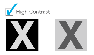
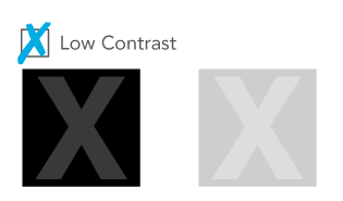
The ADA requirement for color contrast on visual character signs can be a bit vague. While the law only dictates that light characters go on a dark background and dark characters on a light background, the accompanying advisory opinion encourages to use as much contrast as possible to increase legibility for persons with low vision. With our ADA Color Contrast Checker tool, you never have to worry about whether or not your text contrasts with the background of the sign.
703.5.1 Finish and Contrast. Characters and their background shall have a non-glare finish. Characters shall contrast with their background with either light characters on a dark background or dark characters on a light background.
ADVISORY 703.5.1 FINISH AND CONTRAST: Signs are more legible for persons with low vision when characters contrast as much as possible with their background. Additional factors affecting the ease with which the text can be distinguished from its background include shadows cast by light sources, surface glare, and the uniformity of the text and its background colors and textures.
What is the difference between a symbol and a pictogram?
A pictogram is any graphic or icon that visually represents a space. For instance, the male and female icons on the below sign tell us that the space we are about to enter is a unisex restroom. The difference between a pictogram and a symbol is that a symbol is informational. It typically gives more information about a space, but does not define the space. For example, a no smoking symbol informs everyone that smoking is not allowed in that area or space. Pictograms generally have more requirements that they must meet for ADA compliance.
703.6.1 Pictogram Field. Pictograms shall have a field height of 6 inches minimum. Characters and Braille shall not be located in the pictogram field.
703.6.2 Finish and Contrast. Pictograms and their field shall have a non-glare finish. Pictograms shall contrast with their field with either a light pictogram on a dark field or a dark pictogram on a light field.
703.6.3 Text Descriptors. Pictograms shall have text descriptors located directly below the pictogram field. Text descriptors shall comply with 703.2, 703.3, and 703.4.
Do I need braille under the International Symbol of Accessibility?
The International Symbol of Accessibility (ISA), or handicapped symbol, is just what it says it is: a symbol. Symbols give more information about a space, but it does not define the space. Therefore, the ISA symbol is not required to have braille nor a tactile descriptor underneath. Also, unlike pictograms, there are no minimum size requirements for symbols. The only requirement is that the symbol is visible against its background; either light on dark, or dark on light.
703.7.1 Finish and Contrast. Symbols of accessibility and their background shall have a non-glare finish. Symbols of accessibility shall contrast with their background with either a light symbol on a dark background, or a dark symbol on a light background.
703.7.2 International Symbol of Accessibility. The International Symbol of Accessibility shall comply with Figure 703.7.2.1.
ADVISORY 103 Equivalent Facilitation
Nothing in these requirements prevents the use of designs, products, or technologies as alternatives to those prescribed, provided they result in substantially equivalent or greater accessibility and usability.
What is the installation height for my ADA signs with braille?
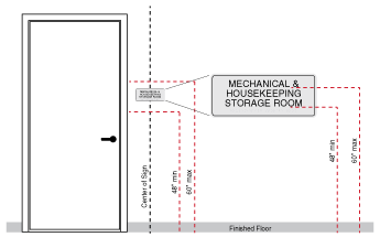
Tactile, or braille signs, are required to be installed 48 inches minimum and 60 inches maximum above the floor surface. It sounds simple, but the confusing part is that you don't measure from the edges of the sign. Instead, you must measure from the baseline, or bottom, of the lowest and highest tactile characters on your sign. The easiest way to approach this is to place the center of your sign at 54" above the ground. This almost always guarantees that your braille sign will be installed at a compliant height. And don't forget, you should install these signs on the latch side of the door.
703.4.1 Height Above Floor or Ground. Tactile characters on signs shall be located 48 inches minimum above the floor or ground surface, measured from the baseline of the lowest tactile character and 60 inches maximum above the floor or ground surface, measured from the baseline of the highest tactile character.
EXCEPTION: Tactile characters for elevator car controls shall not be required to comply with 703.4.1.
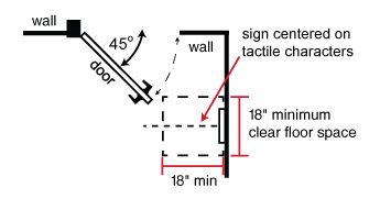
703.4.2 Location. Where a tactile sign is provided at a door, the sign shall be located alongside the door at the latch side. Where a tactile sign is provided at double doors with two active leafs, the sign shall be located to the right of the right hand door. Where there is no wall space at the latch side of a single door or at the right side of double doors, signs shall be located on the nearest adjacent wall. Signs containing tactile characters shall be located so that a clear floor space of 18 inches minimum by 18 inches minimum, centered on the tactile characters, is provided beyond the arc of any door swing between the closed position and 45 degree open position.
EXCEPTION: Signs with tactile characters shall be permitted on the push side of doors with closers and without hold-open devices.
What are the installation requirements for visual signs?
Visual ADA signage installation is based entirely on the viewing distance of the sign. While we won't go into detail for all scenarios, we will cover installation requirements for common visual text signs used inside most buildings, such as directionals and information signs. Visual signs have a minimum text height of 0.625" for wall-mounted signs, and should not be installed lower than 40 inches above the floor surface. Alternatively, some visual signs may be installed overhead, but the text height must increase to a minimum of 2 inches to maintain compliance.
703.5.6 Height From Finished Floor or Ground. Visual characters shall be 40 inches minimum above the floor or ground.
EXCEPTION: Visual characters indicating elevator car controls shall not be required to comply with 703.5.6.
If you still have questions, please reach out to us. We have a full-time ADA signage expert on staff that can assist with any question you may have about ADA signage compliancy. Give us a call at 1.877.714.6588 or fill out the form on our contact us page, and we'll get back to you shortly.
 Log In
 Contact Us